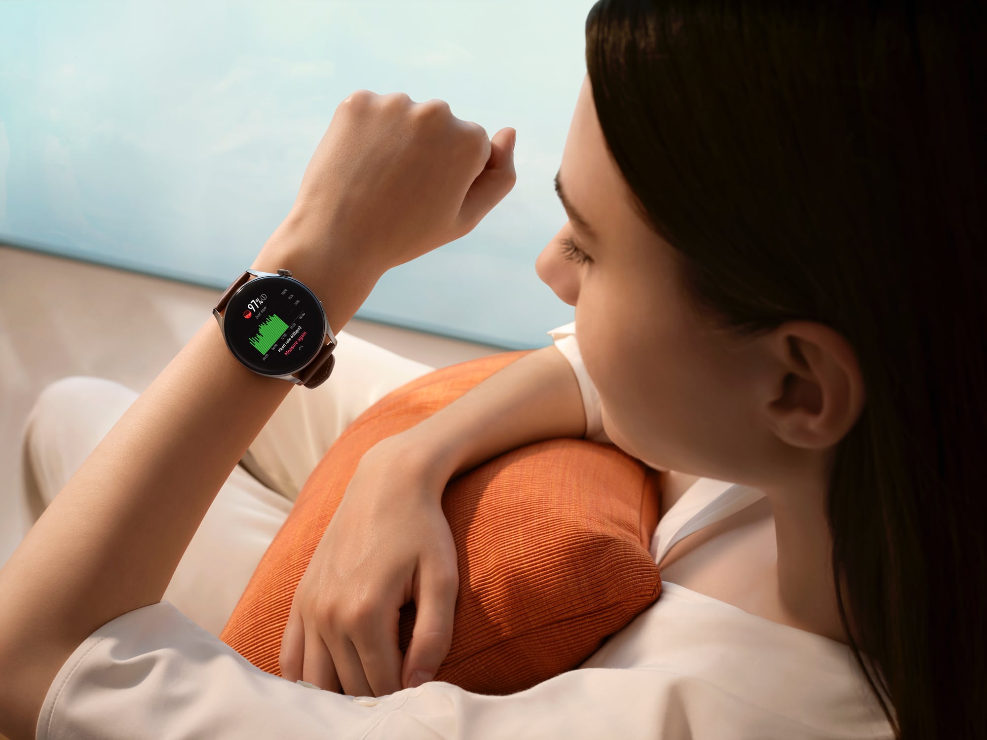
Huawei’s latest Watch 3 smartwatch series comes in three models of Watch 3 Active (S$548), Watch 3 Classic (S$598) and Watch 3 Classic Pro (S$698).
The Watch 3 Classic and Watch 3 Active are basically the same model with a similar 46mm stainless watch case but different colour in watch case and different straps. The silver Watch 3 features brown leather straps, while the black Watch 3 Active uses black fluoroelastomer straps.

On the other hand, the Watch 3 Classic Pro features a bigger 48mm titanium watch case with sapphire glass and a brown leather strap. It also features longer battery life than the other two models.
But all Watch 3 smartwatches have a 1.43-inch round AMOLED colour display and water resistant down to a depth of 50m. In addition, they are the first Huawei smartwatches to be powered by its fledging HarmonyOS.
And they also have fitness features such as tracking of SpO2 (blood oxygen levels), heart rate, sleep quality, skin temperature and stress. For this review, we test the Watch 3 Classic.
SPECS
PRICE: $598 (Classic version), available from 6 Aug in Lazada and Shopee
DISPLAY: 1.43-inch (466 x 466 pixels)
CONNECTIVITY: Bluetooth, NFC, Wi-Fi, eSIM
WEIGHT: 54g (without strap)
DESIGN
With an analogue watch face, the Watch 3 can be easily mistaken as a classic quartz watch. As such is the classic and elegant design of the Watch 3.

In addition, the watch lets you easily swop 22mm watch straps, which you can get off-the-shelf. This is great, as you probably will not want to be wearing the leather strap for your runs or workouts.
The stainless steel watch case with its curved classic lugs add to the elegant design. There are only two buttons on the right side of the case – a pushable rotating crown at the 2 o’clock location and another side button at the 4 o’clock position. The crown is the home button, while the side button offers a shortcut to the Workout menu.
FOR
+ Classy elegant design
+ Gorgeous and responsive display
+ Offers eSim 4G connectivity
+ Accurate fitness and sleep tracking
AGAINST
– HarmonyOS and AppGallery still needs work
– Loud voice notification during workouts
Its round watch case has a single piece of glass over its display that seems to gel seamlessly with its black bezel. When you run your finger from the bezel to the glass, you can feel the same smooth texture.
The circular display is gorgeous and makes any watch face displayed look life-live. Plus, the display is responsive to all your touches. Swipe up will bring up the notifications, and swipe down lets access the settings menu.
Swiping right leads the weather, while swiping left moves you through four customisable widgets. By default, there will be three widgets are activity records, heart rate and SpO2.

The new HarmonyOS offers a new user interface (UI) via a grid launcher app menu by pressing the crown. The UI looks quite similar to Apple’s watchOS.
In fact, the Watch 3’s rotating crown looks and works like the crown found on Apple Watch. For instance, there is a nice haptic feedback when you rotate the crown.

PERFORMANCE
For this review, the Watch 3 is tested predominantly with a Huawei P40 Pro that comes pre-loaded with AppGallery – Huawei’s own app store.

However, the smartwatch can also be used with an Android smartphone or iPhone via the Huawei Health app to pair with the watch. But for Android users, you have to download Huawei’s AppGallery first.
Not to mention, with the iPhone, you lose the ability to buy watch faces and access to Huawei Music. Even on AppGallery, I found limited apps and watch faces to download compared to huge library of Google Wear OS.
Yes, Huawei’s AppGallery and HarmonyOS will still need sometime to mature. It is always difficult to start from scratch. But if any entity could do it, you can bet on Huawei to do so.

But there is some good news. The Watch 3 is the first smartwatch with eSIM 4G connectivity. When activated, it does not need to be paired with a smartphone to be connected to the Internet. Thus, you can still call, message and receive notifications even without a smartphone. On the downside, it is only currently compatible with Singtel.
In terms of fitness tracking though, the Watch 3 is one of the best in the market. For step tracking, its readings vary by only around 5 per cent from my calibrated Apple Watch Series 4.

For GPS-tracked runs, the tracked distance is only off by 20m on a 4.6km jogging route along a park connector. One downside though was the loud voice notification that sounds off at every kilometre during a run.
It is quite embarrassing to let fellow joggers know how slowly I was running. Plus, the loud commentary might be disturbing the neighbourhood since I tend to run at night. I only found the option to disable sound only when I swiped to the End Workout screen.
Sleep tracking is spot-on too. It pinpointed the time I went to bed and woke up as well as when I got up to visit the toilet. There are also sleep cycle graphs that break your sleep patterns into deep sleep, light sleep and rapid eye movement sleep, to provide insights into how to improve your sleep.

BATTERY LIFE
Battery life of Watch 3 is rated at 3 days in smartwatch mode and two weeks in ultra-long battery life mode.
During the tests, with the smartwatch constantly connected to the Huawei P40 Pro as well as a 4.6km jog and a 2km walk thrown in, I found the Watch 3’s battery level dropping to 20 per cent by the end of second day.
In comparison, my Apple Watch Series 4 needs to be charged daily. Still, I recommend charging the Watch 3 every other day.
VERDICT
In terms of hardware, the Huawei Watch 3 Classic is top-notch with excellent build, elegant design and great fitness tracking performance.
But its software will need more work if it is to establish itself as a serious disruptor to the dominance of Apple’s watchOS and Google’s Wear OS.
RATINGS
FEATURES: 8/10
DESIGN: 9/10
PERFORMANCE: 8/10
BATTERY LIFE: 7.5/10
VALUE FOR MONEY: 8/10
OVERALL: 8/10


