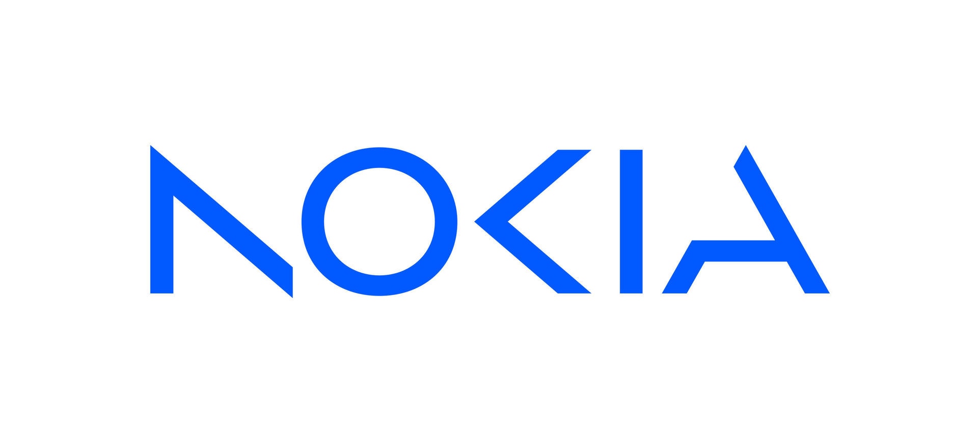
Nokia, a once-dominant smartphone company, has revealed a new brand identity for the first time in almost 60 years. The unveiling took place on Sunday, ahead of the start of Mobile World Congress Barcelona, and marks a significant departure from the company’s previous logo, which was defined by an iconic typeface and “Yale blue” color.
Nokia claims that the new logo is more modern and digital, reflecting the company’s status as a business-to-business technology innovation leader that is pioneering the intersection of networks and cloud. According to CEO Pekka Lundmark, Nokia’s refreshed brand identity reflects a new strategy that focuses on industrial digitalization and network technology, rather than mobile phones.
The new logo unveiled by Nokia does not necessarily mean the end of the iconic logo that many people know and love. Since Microsoft’s acquisition of Nokia’s Devices and Services division in 2014, Nokia’s phone business has not been a part of the company. Instead, HMD Global, a company led by former Nokia executives, acquired the rights to use the Nokia brand for smartphones and tablets. In fact, HMD Global recently announced a new device, the G22, which features the classic Nokia logo. It remains to be seen whether HMD Global will continue to use the old logo or adopt the new one.
I mean, I cannot be the only one who remembers the shaking hands animation when you turn on a Nokia device, right?


